UK Parliament

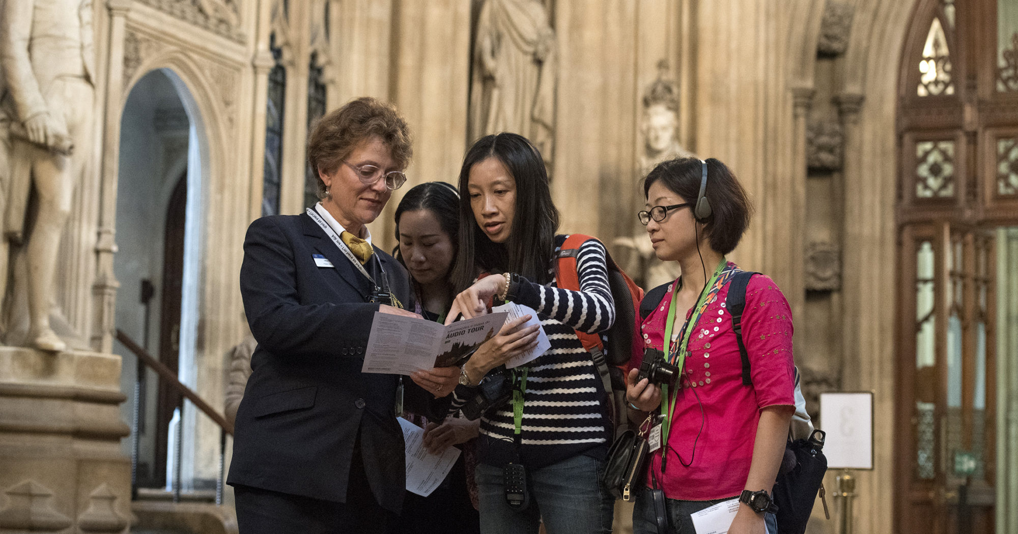
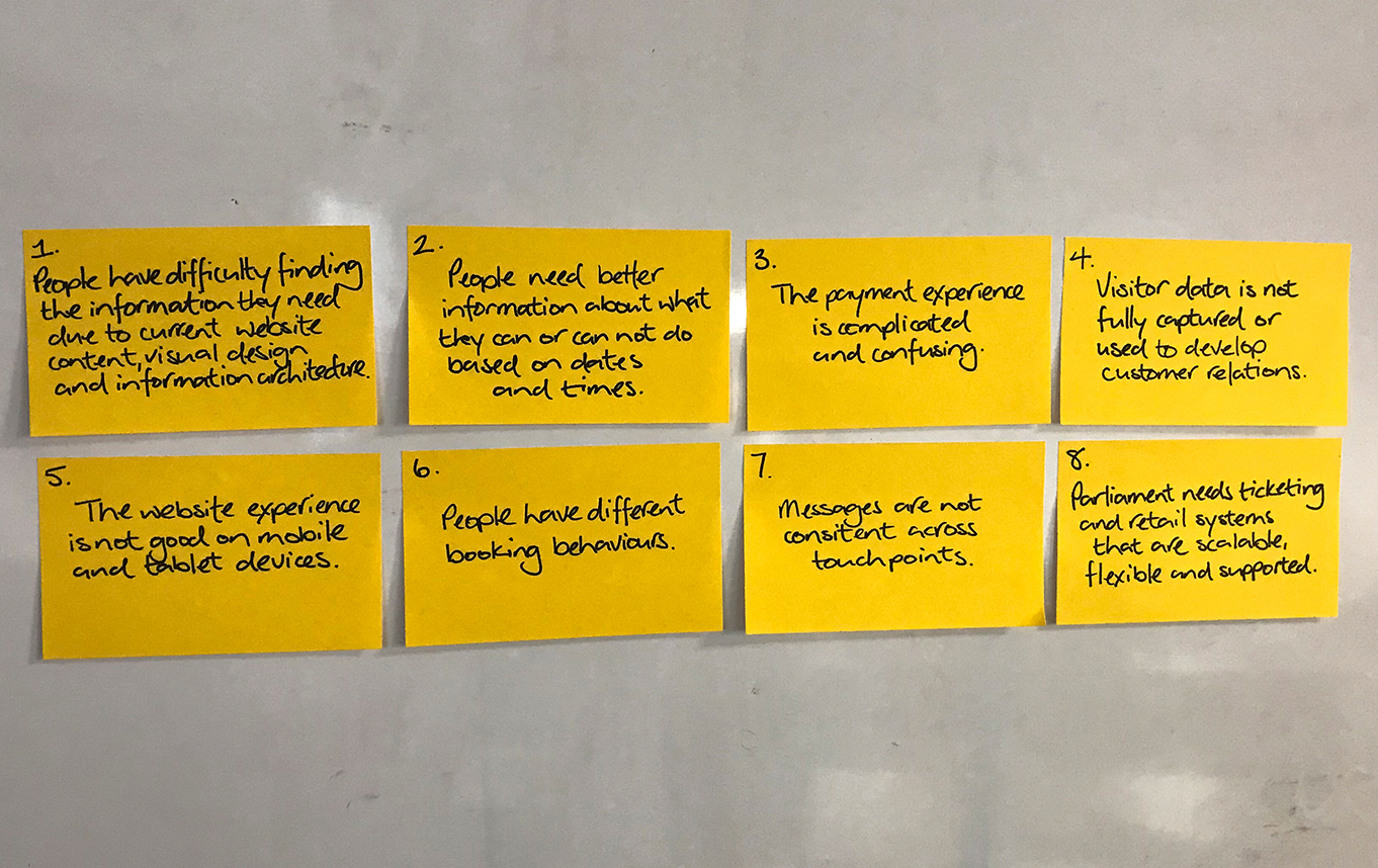
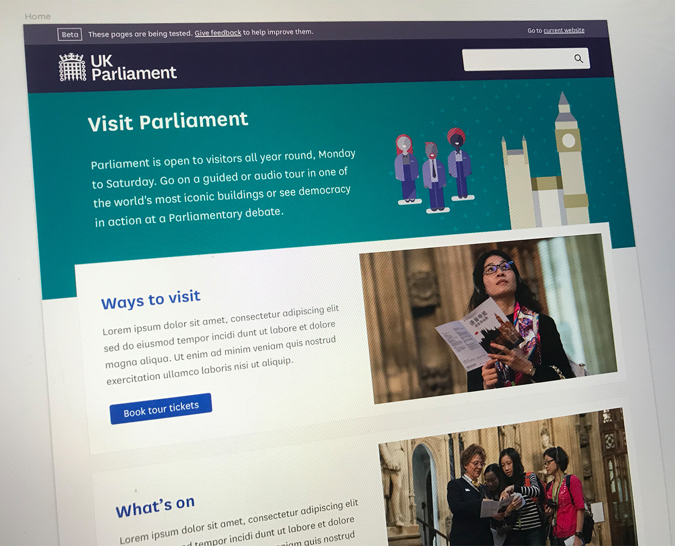
Parliament is one of the most popular attractions in London and is open to visitors year round. Every year, more than half a million people go on tours, attend debates and committee sessions, meet with their MP, visit exhibitions, and attend events in one of the world’s most iconic buildings.

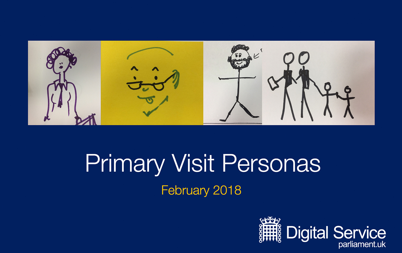
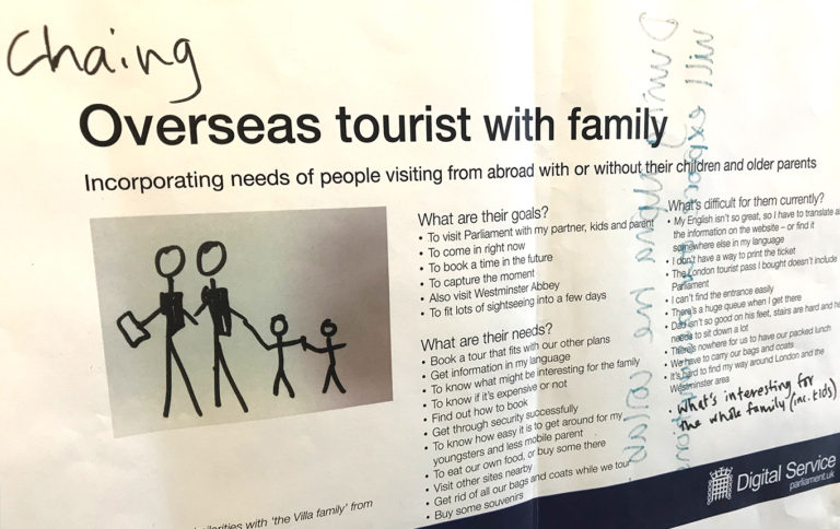
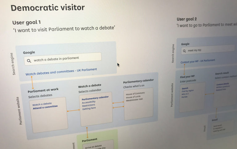
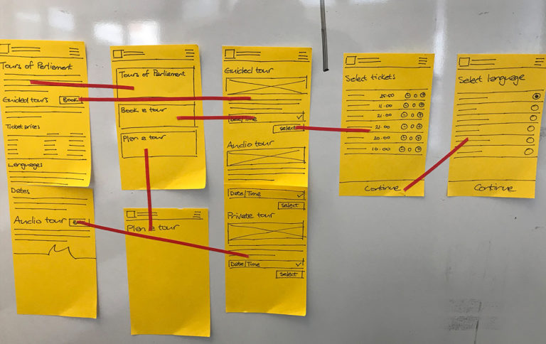
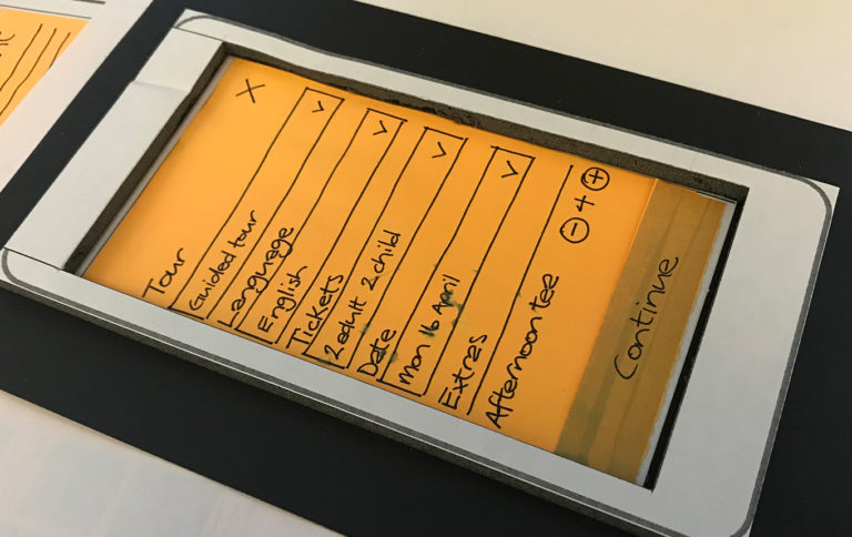
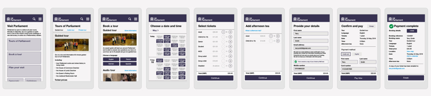
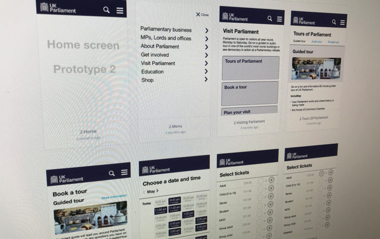
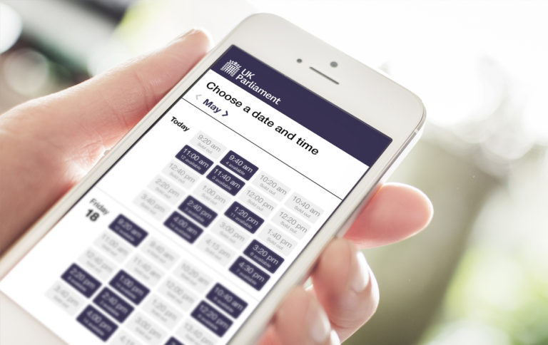
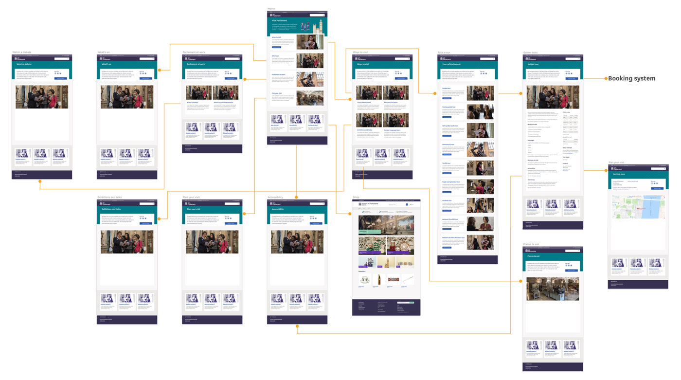
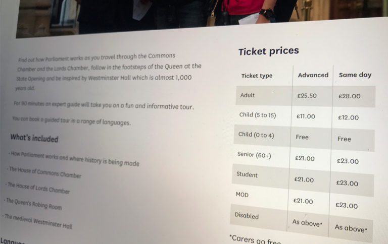
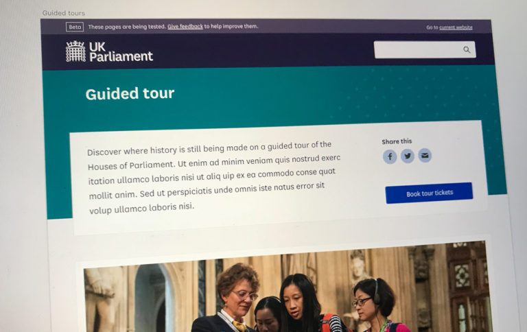
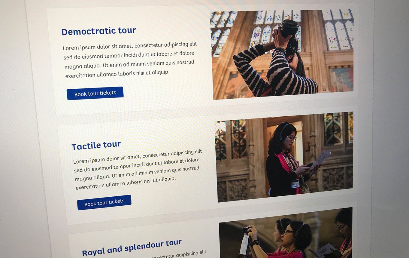
This piece of work consisted of the implementation of a new ticketing system and the redevelopment of the related Visit Parliament information pages on the new Parliament beta website. Publicising information and selling opportunities to visit UK Parliament through tours, events and venue hire.

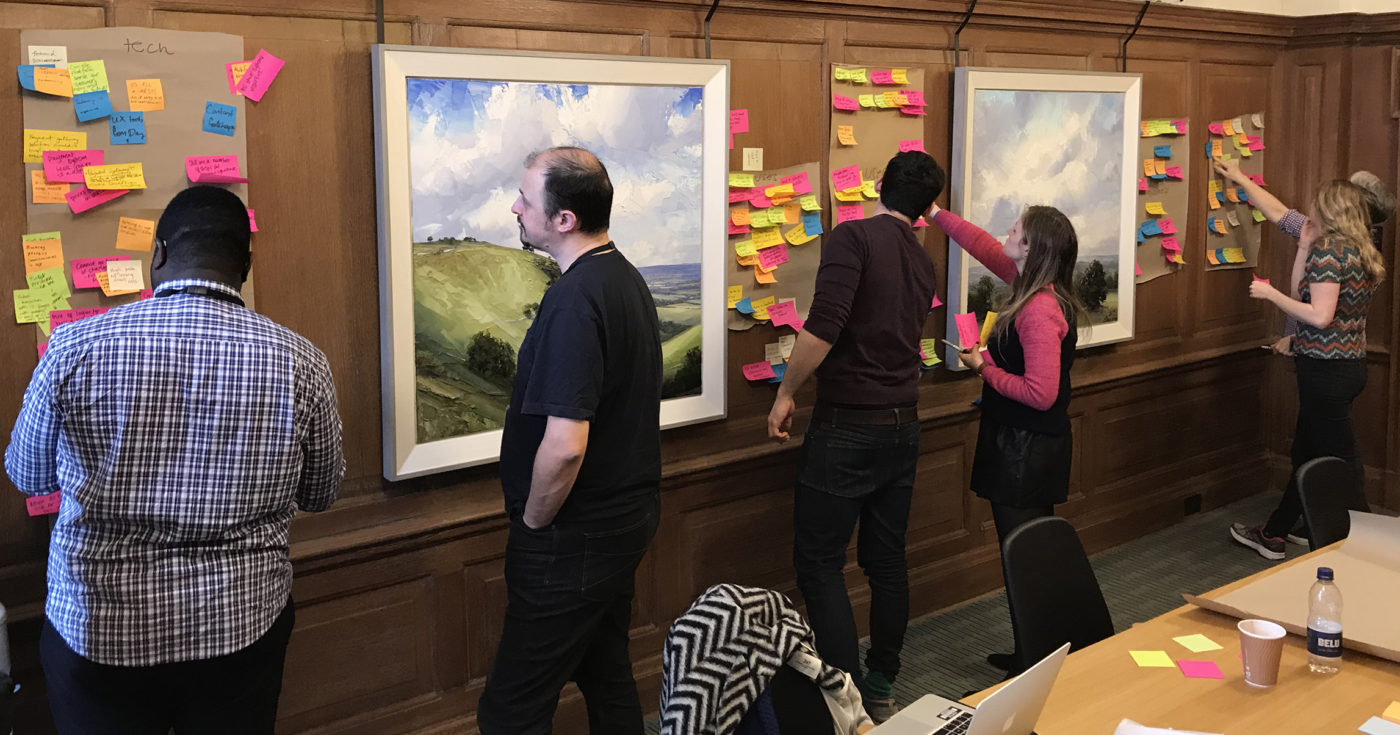
The duration of this work consisted of an 8 week Discovery, a 10 week Alpha and an 18 week Private Beta.

Problems to solve

  • Users experienced difficulty finding the visiting information they needed to help decide which tour to attend.
  • The current Parliament booking system was approaching end of life. A new flexible and scalable system was required and needed to align with the new Parliament Beta website.
  • The current Parliament website experience was not responsive which made it difficult for users to buy tickets for tours on mobile devices.

Key tasks and deliverables

Discovery

  • Personas.
  • Intercept interviews.
  • Stakeholder interviews.
  • Direct customer interviews.
  • Stakeholder workshops.
  • Design and usability analysis of competitor ticketing systems.
  • Attend guided tours of Parliament.
  • Analysis of current ticket purchasing process.
  • HotJar heat maps.
  • Customer journey mapping.

Alpha

  • Closed card sorting.
  • Design hypothesis.
  • User journeys.
  • Interface designs.
  • Invision prototypes.
  • Intercept user testing.
  • Analysis and synthesis of data.
  • Present findings back to the team and stakeholders.

Beta

  • Work with development team to build a working version of the prototype using real code.
  • Design and document new responsive designs of UI components following existing design patterns.
  • Work closely with the content designer to create the designs around the content.
  • Carry out continuous user testing making constant iterative improvements.

Discovery

Starting with an 8 week Discovery to identify the primary users, what are their needs and how they are being met, or not and what the key user journeys are for someone visiting the website.

Personas

The personas were selected from a set of user types that were developed during a series of stakeholder workshops. They represented what we assumed we knew about our users, their needs and the difficulties they experienced.

Further changes were made to the personas as we learned more during Discovery.

Current ticket purchasing process

I analysed and mapped out the purchasing ticket flow using the current booking system to identify any immediate problems and quick fixes.

Customer journey mapping

I wrote real world scenarios and created actors based on the personas to visualise 4 customer journey maps in order to gain a richer understanding of the primary customer experiences. Each scenario followed the steps it would take to complete customer goals, identifying any difficulties from the customer’s perspective.

Parliament tours

To help gain a better understanding of the products we were selling, the team went on a variety of Parliament tours documenting the experience along the way, each presenting our findings back to the team at the end.

Discovery conclusion

We ran a 2 day team analysis workshop at end of discovery to playback all that we had learned and to clearly define the key user findings. We prioritised our list of 40 findings into those we thought were the most important.

The final part of this workshop was to collectively decide if the research we had conducted had provided us with enough knowledge and evidence to move into Alpha.

User goals

By the end of Discovery, we had clearly defined the goals we would use to build our prototypes around.

Alpha

Using the Discovery insights, we began to experiment with solutions to address the challenge. We rapidly tested our assumptions to see what worked and what we could throw away.

Closed card sort

I conducted a closed card sort in Westminster Hall to help discover peoples understanding of labels and their expectations of the organisation of content to help shape the information architecture.

User journey hypothesis

I hypothesised various customer journeys to drive the design assumptions. These were presented to the team where we agreed which journeys to use in the prototype.

Design hypothesis

As part of the process to produce each prototype, I hypothesised what our customers wanted to do in order to prove or disprove the assumptions.

Paper prototypes

Using modular sketched components, I was able to rapidly create screens and flows. The modular components allowed us to make changes on the fly. The intention was to not test this method with users but to create something tangible to stimulate discussions amongst the team and to form the basis of which the clickable prototype would be built on.

Interactive prototypes

My tools of choice for the prototypes was Sketch for the UI screen designs and Invision for interactions and user testing. We discovered early on that high numbers of users were attempting to access the website on mobile devices. This led to the decision to take a mobile first approach. This also made it easier for us to conduct gorilla testing on a mobile phone rather than using a laptop.

User research

Testing

I challenged the team to complete the process of design, prototype, test and analyze with in each 2 week sprint. To achieve this, we chose to use gorilla testing at various tourist rich locations around London. I facilitated 3 rounds of testing with a total of 18 participants.

Data analysis and synthesis

We analysed all the data we received from testing – this was done a lot and in great detail and with the whole delivery team. We put a great deal of effort into the refinement of the findings to ensure the quality of our data was robust and accurate. All of the data from each round of testing was used to help shape the hypothesis and designs for the next round.

Alpha conclusion

By the end of Alpha, we had an end-to-end prototype that we were confident met the needs of our primary users. There were still some gaps in assumptions but nothing big enough to prevent us from moving forward. The user journeys were defined, the team resources were onboard and we had a plan in place to move into Beta.

Beta

The objective for Beta was to build a working version of the prototype using real code. As the designer, I worked with existing design patterns as well as creating new patterns needed for the new area of the website. I continued to make iterative design changes to improve the website to meet user needs and to continue testing with users.

Design reviews

I facilitated silent critique sessions with the delivery team as a method to stimulate insightful and thought-provoking feedback in order to make improvements.

Design challenges

A major challenge that I faced whilst creating designs for the new Visiting section of the website was to work with in the constraints of an existing complex navigation pattern. This pattern was designed to address the need for users to access articles that could exist in multiple content collections. The pattern served a single purpose but quickly proved to be limited as it didn’t work for other areas of the website. Therefore, a new design was required to enable users to navigate up to parent pages, communicate where pages existed with in multiple collections and to allow users to navigate to other related content pages with out forcing users to go back.

Below are design concepts that I worked on to try and solve this complex problem.

I left the project during the development of the visiting landing page MVP. The plan was to release to Beta and conduct further user testing on the live pages followed by further analysis, iterations and more design enhancements.

window.dataLayer = window.dataLayer || []; function gtag(){dataLayer.push(arguments);} gtag('js', new Date()); gtag('config', 'UA-90024280-1');